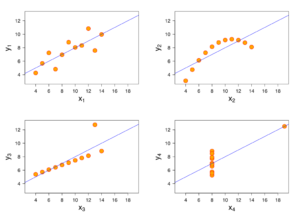
Look at that data below. You instantly know these four sets of data points are vastly different, and thus your expectations about what new data would look like are also different. 
Yet, a computer might not notice what you are noticing. Many statistical features of these sets are equal – means of both x and y, variance, correlation between x andd y and also the linear regression (the blue line).
We have these beautiful examples thanks to Francis Anscombe, who made them in 1973. Next to showing what outliers can do to your metrics, he wanted to demonstrate that one always needs to take a look at data and not blindly trust statistical algorithms.
Yet here we are in 2018, where statistical algorithms are much more pervasive than 45 years ago, and it is still important to inspect data with your own eyes. Data can have gaps or novel outliers. This holds epecially for live systems, where data comes in from other systems and many things can go wrong outside of our control.
When we take time to construct data-rich interfaces, we add actual safeguards to our applications. Making the UI appealing pleases the users, but it also makes it more likely that they will use it regularly. This, in turn, will make it more likely that they will detect problems in the data, which the algorithms are not trained for (yet), and tell us, so we can fix the problem.
It is worth the effort.


You really need a radial chart to get a proper understanding of data though
Radial charts are like Wodka – they make some products better, but some way worse!